How to configure cards on your Boardly dashboard
Access card configuration
- On your dashboard, in editor mode, click the "Configure display" button.

- Select the "Cards" view type.

- Click on the "Configure cards" tab in the top right.
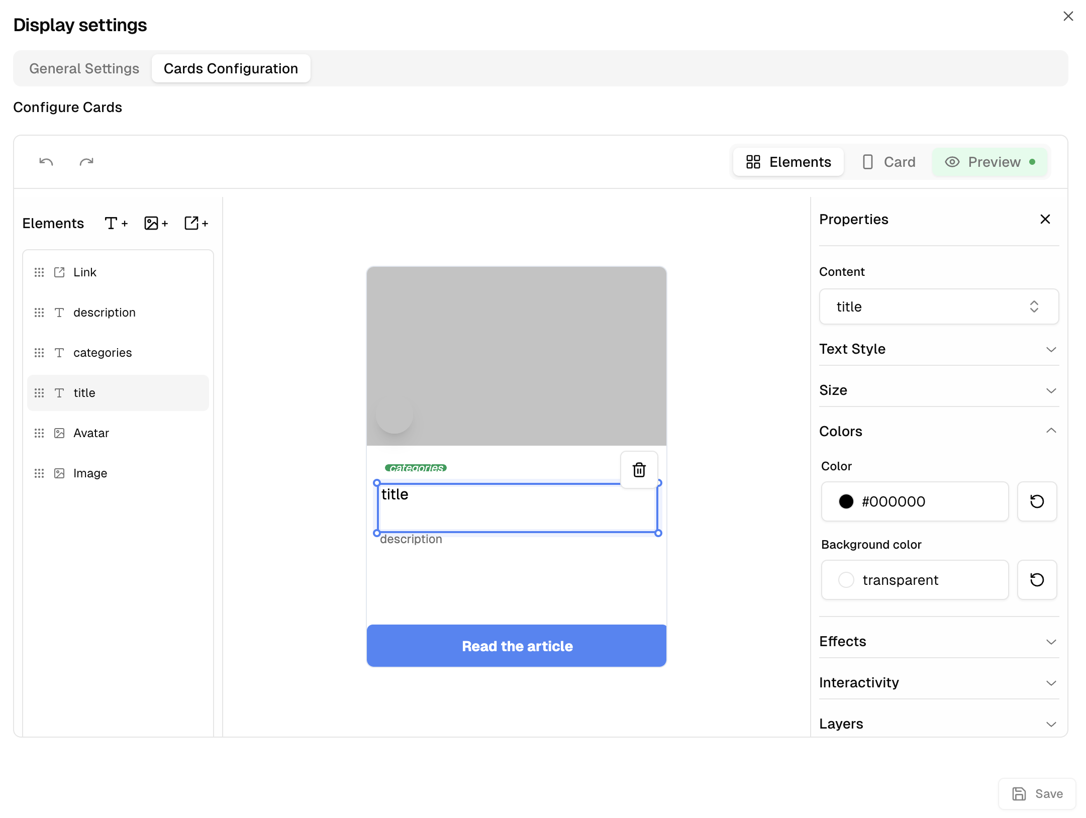
Configuration interface
The interface is divided into three main tabs:

Elements
Configure card elements
Card
Style of the card itself
Preview
Visualization of changes
Top toolbar
Top left: editing buttons (undo, redo)
Top right: tab navigation

Elements Tab
Add and configure your card components
Add elements
Text
Titles, descriptions, labels...
Image
Photos, logos, icons...
Button
Actions, links...

Layers panel
The left panel displays all added elements as layers, similar to software like Photoshop.
- Click on an element to select and configure it
- Rearrange elements by dragging them up or down
- Element order determines their overlay on the card

Elements configuration
When an element is selected, the right panel displays its configuration options.
Content source
Google Sheets column
Displays data from the selected column
Custom text
Displays fixed text on all cards
Templating
Combine text and variables: "Author: {AuthorName}"

Text configuration
Formatting
Bold, italic, underline
Alignment
Horizontal and vertical
Style
Size, color, background
Adaptation
Container width and padding
Effects
Shadow and rounded border
Interactivity
Click actions
Badge examples
Image configuration
Display style
Cover, Contain, or Stretch
Position
9 positioning points
Effects
Shadow, rounded border, fade
Interactivity
Click actions
Button configuration
Text options
All text options are available
Icons
Add predefined icons
Card Tab
The "Card" tab allows you to configure the general appearance of the card itself, without the elements.
Quick presets
Light
White background
Dark
Dark background
Custom
Your own settings
Configuration options
Card size
Between 200 and 500 pixels
Interactivity
Click action on the whole card
Colors
Background or gradient
Border
Display, color and radius
Effects
Background blur, shadow
Opacity
Background transparency

Preview Tab
Real-time visualization
The "Preview" tab (with green background) allows you to visualize how your cards will appear with your current configurations, before saving them.

Tip
Take time to experiment with different configurations to find the one that best presents your data. Use the Preview tab regularly to check the appearance of your cards before saving your changes.